Ford
I led the team of extremely talented designers in the BBDO/Omnicom pitch winning effort. Our task was to unify the brand, push it forward and optimize for mobile.

Starbucks
An exploration of how best to tell the Starbucks brand story.
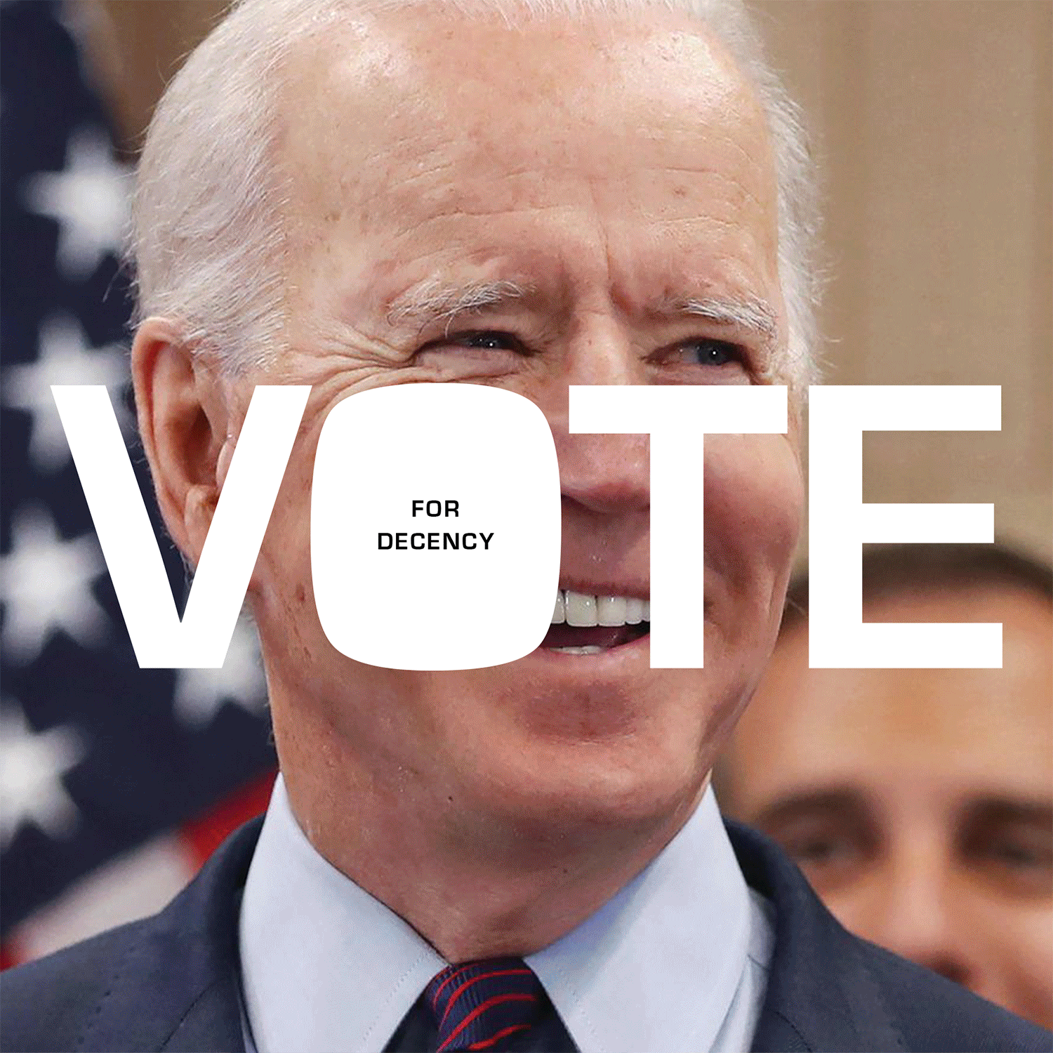
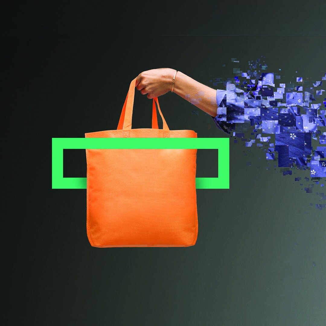
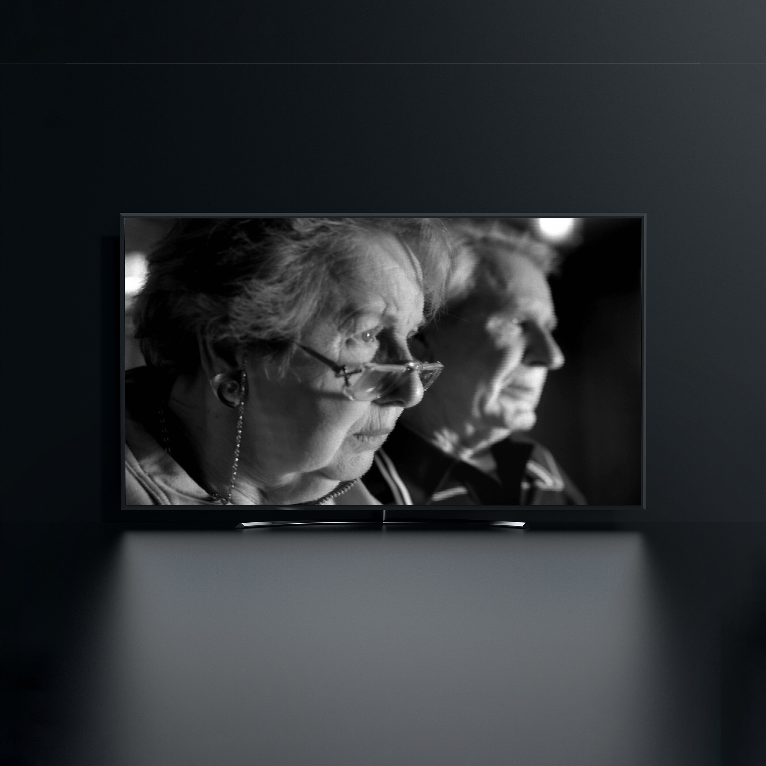
Vote
Originally developed for the Lincoln Project. The intent was to help drive turnout by providing a litany of reasons to vote in bite size social media reminders.

Coach
Coach is all things New York City. It’s where the company started. Where it grew as a brand. Where its best influences and fashion ideas came from. For Coach’s 75th anniversary, the iconic luxury brand wanted to celebrate not just than fashion, tradition, and history, but and the city Coach had become part of.

Visa Urban Mobility
As more and more public transit systems across the globe adopt contactless payment for passengers, it creates a unique communications challenge for Visa. To quickly and clearly educate riders to “tap to pay” with their Visa cards, we needed to develop a simple, flexible design toolkit that could deliver messages ranging from “coming soon” to “now here” depending on awareness in that particular market. More important, it needed to do so efficiently and consistently across each stage of a rider’s door-to-door journey.

Whitney
How do we begin to make sense of the 20th Century?

Blackrock
When Blackrock bought the brokerage assets of Merrill Lynch, they needed to let all of the new people know that they had become “BlackRock Citizens.” The Blackrock passport concept (supported by print and digital) was the ticket. It engaged employees from Merrill with a new sense of place.

Morgan Stanley_World wise
No one is more connected globally than Morgan Stanley. The question is: how do you convey "global connectedness" in a way that communicates with authority in a visually interesting way? The filmic realization of Morgan Stanley's World Wise campaign on TV required innovation in both the shooting and editing of the spots. For print and OOH the World Wise message called for simple, but exotic location photography that I’d taken during production. In the end we created a stable brand image that told of experience, global reach and customer engagement.

Just Add Water
The author (who is a friend) thought that he could self-publish a book with art that he just found online. When I told him that might lead him to doing hard time I took a pass at a couple layouts and that quickly turned into the whole thing.

Tommy Hilfiger

Hayden

Johnson’s Olympic Pavilion

Never Not A Lovely Moon
"With great joy I opened up a parcel that arrived today which contained your masterpiece, your book. It arrived on an interesting day. Today I am going for the first time to see my sister in a hospice in Dublin. My beautiful sister, Bernardine, has cancer and is now receiving palliative care. I can't cure my sister but I can bring her precious little treasures that I know will make her smile. I know she will love your book. Thank you so much! Fondest wishes from Ireland. —Madeleine."
Johnson’s Baby
How do you take one of the oldest and most iconic brands in the world and make it relevant again? We gave it a contemporary look, a fresh voice, even a new logo.
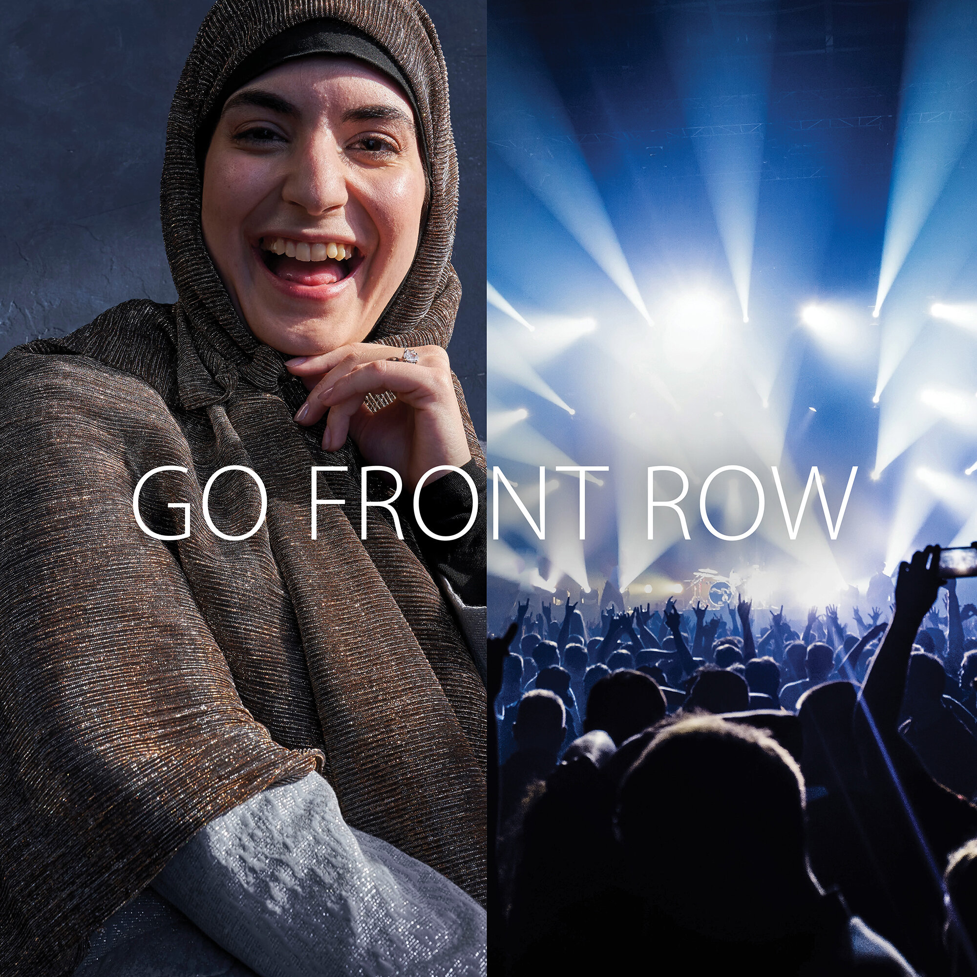
Visa_Affluent
While Visa is one of the most recognized global brands, people are less familiar with Visa’s Affluent portfolio of cards and prefer American Express for their benefits. Additionally, the world of affluence means different things in different countries so we needed a global campaign that was relevant, recognizable and differentiated. We created a global campaign that tapped into a universal truth about affluence being less about possession and more about pursuing your passion – no matter who you are, where you live and what you love doing.

Visa_Hudson Yards
Visa is everywhere you want to be. Including Hudson Yards, the glitzy 1 million square feet of upscale retail space that promised to offer city dwellers and tourists alike a shopping experience unlike your traditional neighborhood mall. As the ‘Official Card of Hudson Yards’, Visa leveraged Hudson Yards as a platform to drive preference for their new Affluent card portfolio. We created a premium and sophisticated design system that showcased the variety of high end activities that tapped into shoppers’ passions, brought to you by Visa.

DuPont_Hi-Sci
Better to be known as a science company than a plastics company...or a coatings company or a petro-chemical company. All of which Dupont was, and no longer wanted to. Hi-Sci (short forHigh science) brought out the green in DuPont by emphasizing smarter and cleaner technology and repositioning them for a low-carbon future.
HPE
The launch of Hewlett Packard Enterprise presented a unique problem. How do you create a new Fortune 100 brand from scratch and successfully spin it off from one of the most famous technology brands in the world? Managing a diverse global team, we created hundreds of communications across advertising, corporate identity, PR and internal comms to successfully establish the HPE brand in advance of their IPO and set them up for years of growth with the “accelerating next” platform.

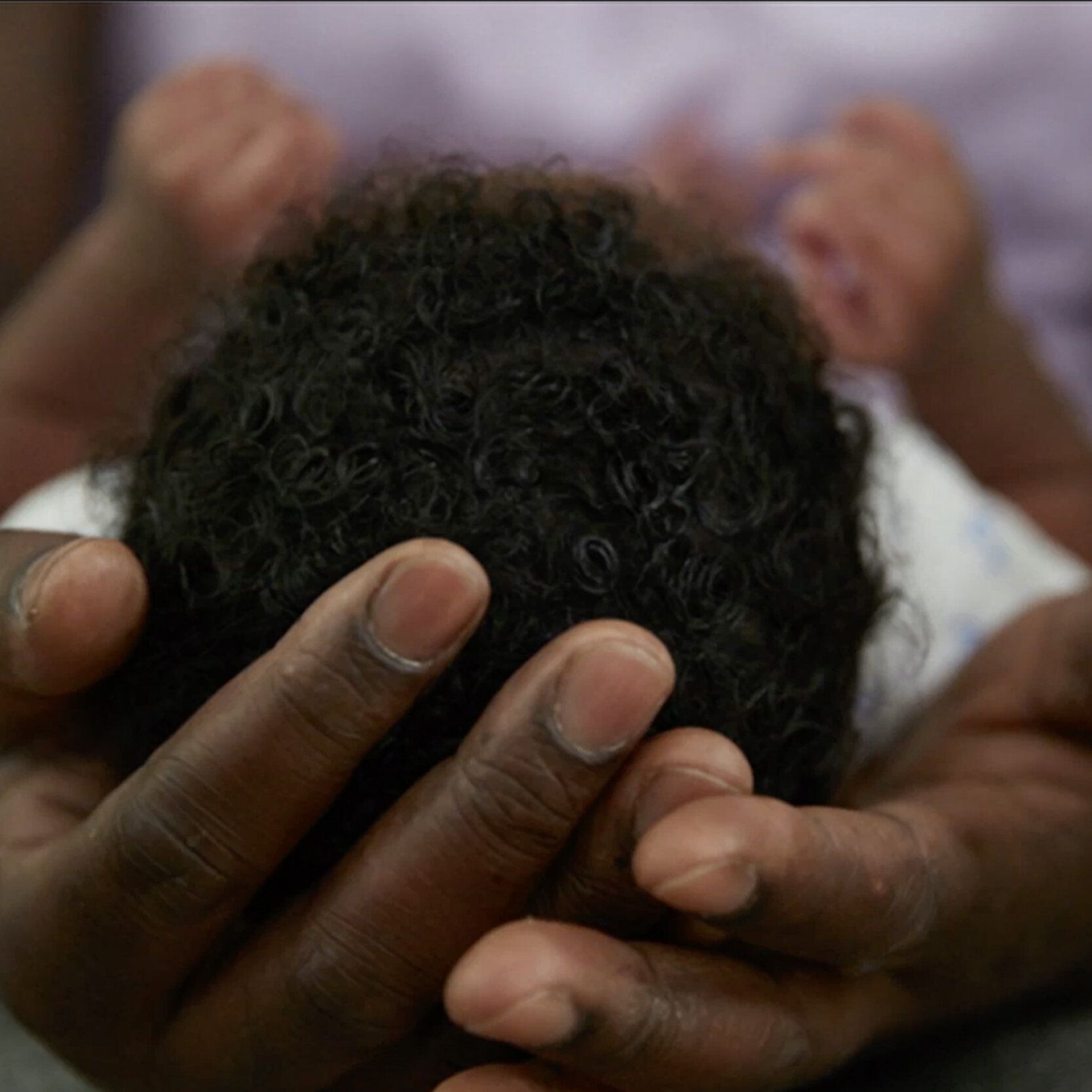
Doctors Without Borders
Our assignment was to raise awareness and drive attendance to: “A refugee camp in the city” which was a free interactive exhibition presented by Doctors Without Borders/Médecins Sans Frontières (MSF) to raise public awareness about the experiences of the world’s more than 68.5 million refugees and internally displaced people.
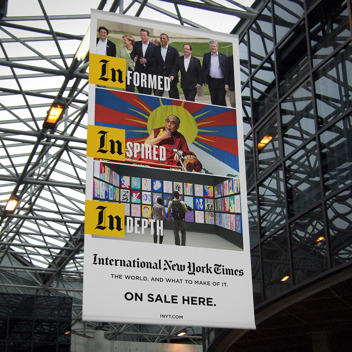
International New York Times
The International Herald Tribune and The New York Times recently joined together to form a new global brand called The International New York Times. It was only about 3 months from the first conversation with the client to the launch of the new brand. We helped create the logo, teaser campaign, TV commercials, direct response advertising, banner ads, print ads, in-flight advertising, outdoor ads, b2b ads, and retail signage. We even designed a unique elevator door message and a cake for the launch event in London.
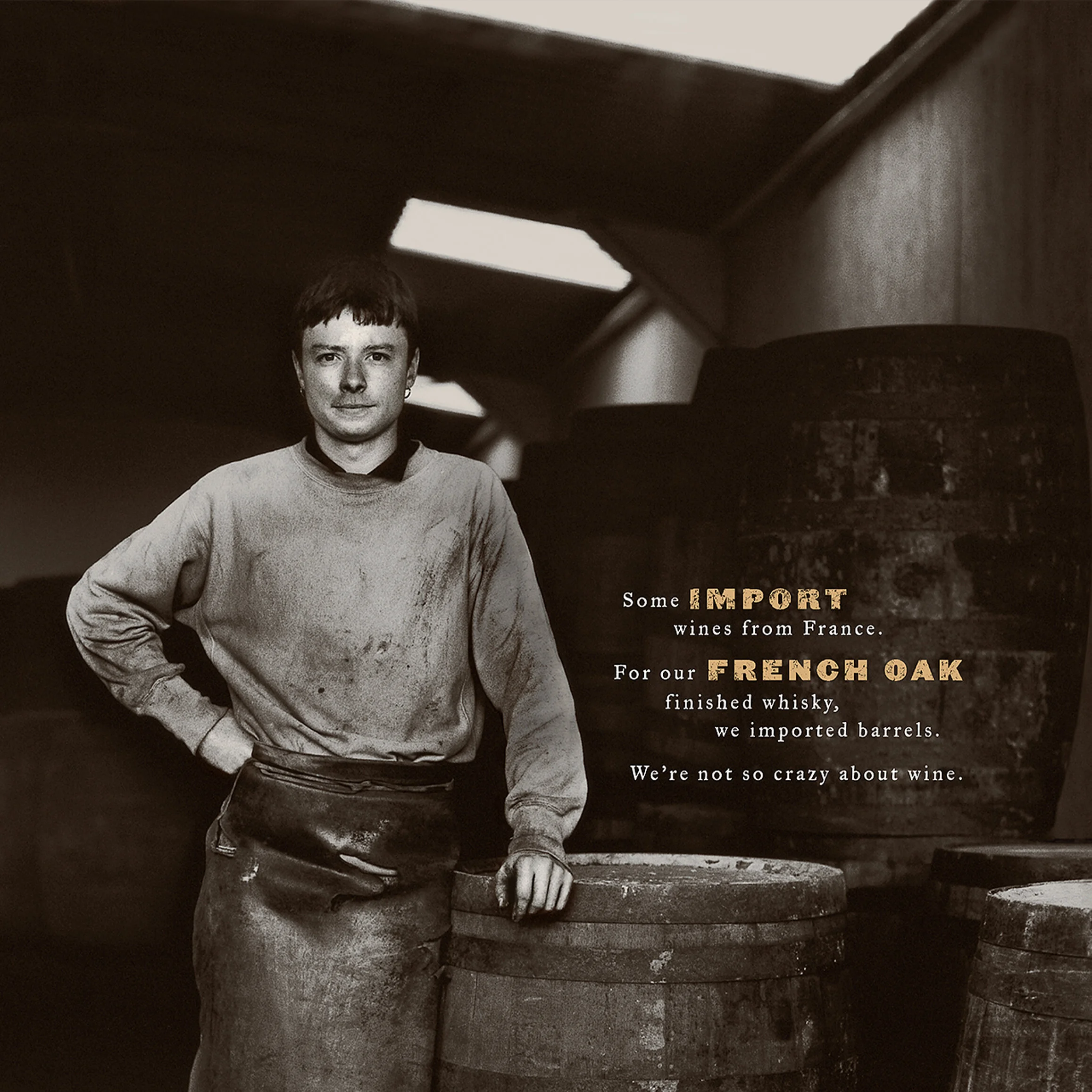
Glenlivet

Dover Rugs
A rug, even a very expensive rug, is something of an impulse purchase. These simple and colorful postcards encouraged people to act on that impulse. The retailer (largest in New England) registered a 15-20% increase in store traffic on weekends after the postcards were mailed. Old-fashioned marketing. Sometimes it works.

Hightower
Before HighTower, there was nothing. No name, No identity, No mission or purpose. Just a few disgruntled brokers who wanted to change the world of financial advice-giving. Make it more high-minded, less churn-y, more personal. We gave the company it’s name. We designed it’s logo and we positioned it as a fiduciary company providing advice without a hidden agenda—giving clients “an unobstructed view” of the market and opportunity.
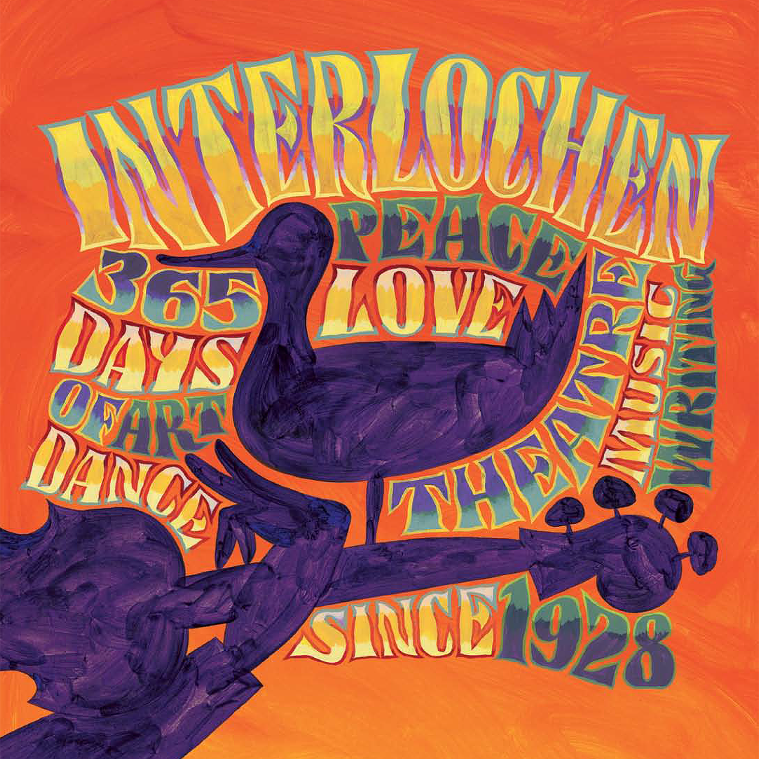
Interlochen

Gillette
mongoDB
Can an $11 Billion NoSQL database company no one’s ever heard of become lovable? Can it become a vital tool for mastering the explosion of data every company today is struggling with? Can it become the darling of darling-adverse developers? I helped create MongoDB’s origin story. Helped coalesce their passion for saying “no to the status quo.” Helped create passion for Mongo among their developer target. And helped them solidify—and expand—their position as the fastest-growing database company in the world.
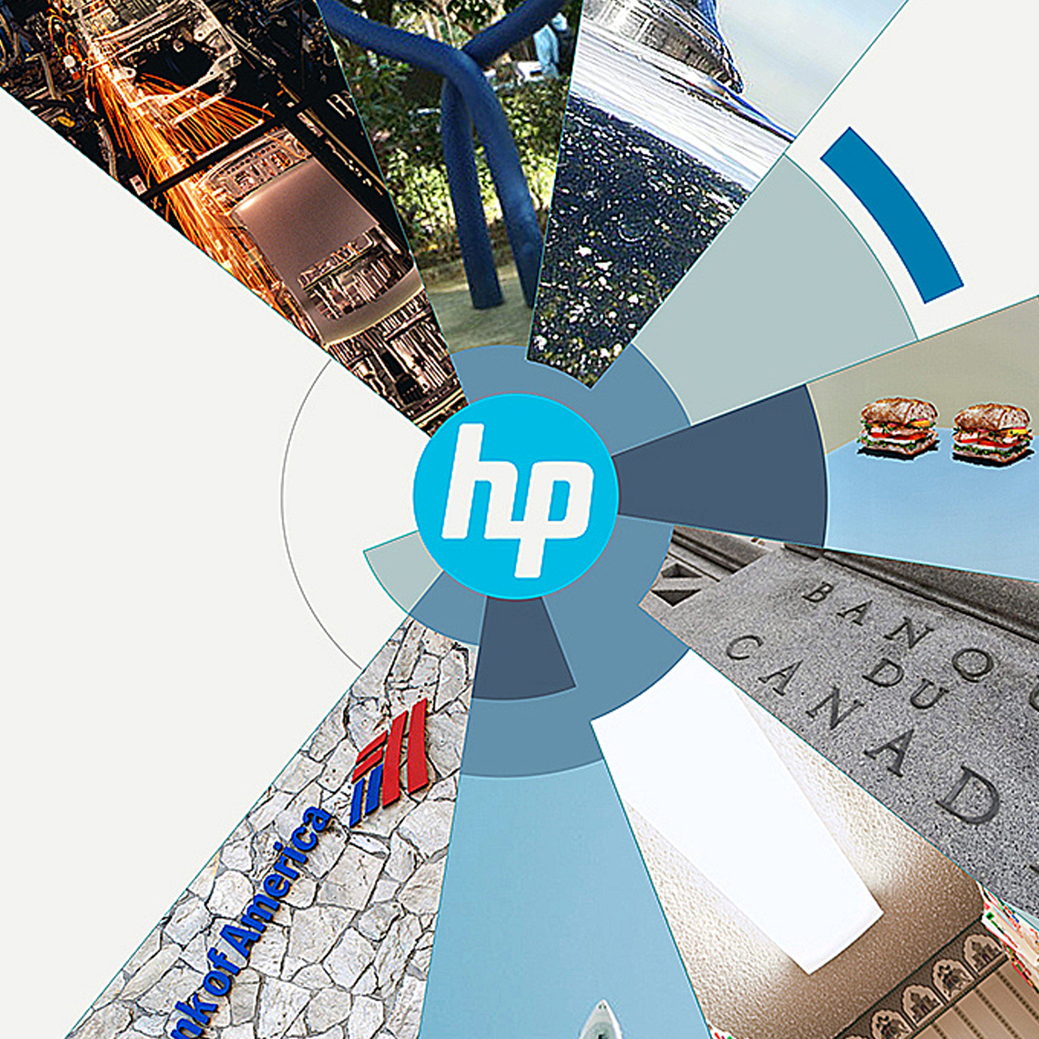
HP
A fundamental promise of any IT brand is simplicity. Taking the complex and unmanageable and reducing it to something clean, understandable and compelling. To explain the vast reach of HP’s IT solutions we used their iconic circular logo to tell the story in an elegant way that spoke with all the simplifying power of their technology.

AT&T
The challenge with AT&T business-to-business is finding new ways to make the invisible magic that connects the world visible. For the better part of a decade we created campaigns built around data visualization, unexpected innovations and human emotion to position AT&T as the network that is making the future possible.
Visa Tokyo Olympics 2020
Visa believes that when there are no borders, there are no limits to where you can go, what you can do, or what you can achieve. This is the essence behind “Everywhere you want to be.” And what better forum to spread this message than on the stage of the ultimate borderless event – the Olympic Games.
J&J Photo Medical Library
J&J is the largest healthcare company in the world. They wanted to show how what they make impacts countless lives. Not with actors in staged photographs. With real medical professionals and patients in a working hospital.
SAP
SAP was a wildly successful German software company that's been trying to find a voice for decades, but the black and white photography, the stories focused on business success, the gentle tweaking of the dotcom bust, all contributed to maintaining their reputation with their Fortune 1000 clientele. Consistency was essential to their success, and by staying with the same photography style and color palette, without increasing spending, their brand value went up year by year.